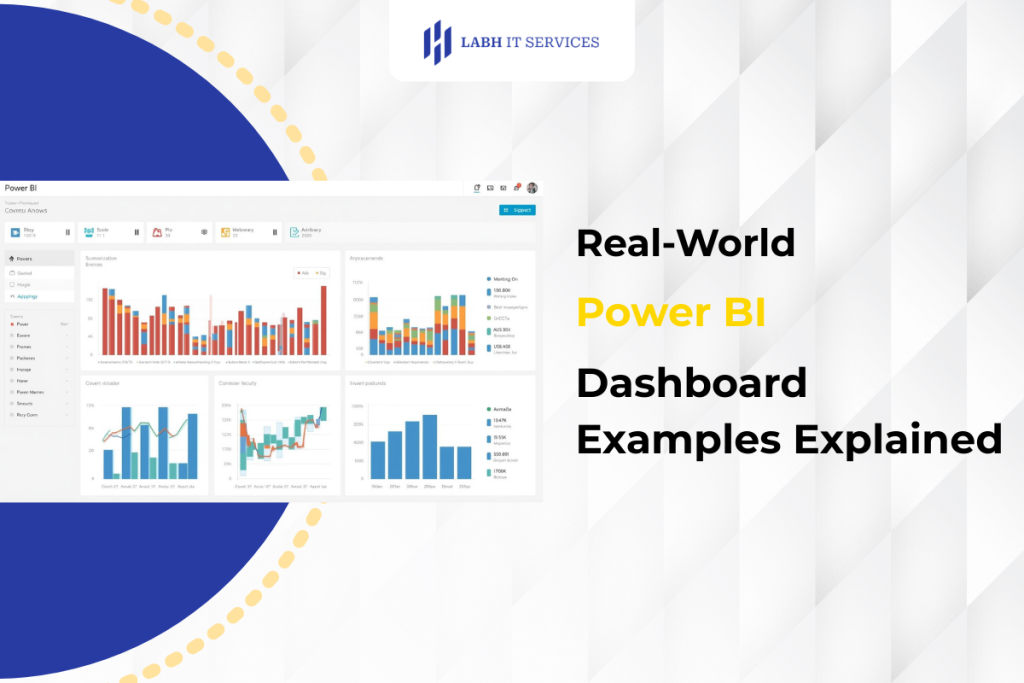
Most businesses have seen dashboards before. Charts, graphs, numbers on a screen. Yet many still struggle to connect those visuals to real decisions. That’s usually because dashboards are built around data, not around how people actually work. When teams look at good Power BI dashboard examples, the difference becomes obvious. The best dashboards don’t just display information. They guide attention and make priorities clearer.
At LabH IT Services, we often meet teams who already have reporting tools in place but still feel uncertain. Dashboards exist, but people don’t rely on them fully. Either they’re too cluttered, too technical, or simply not aligned with daily decisions. When dashboards are designed properly, that hesitation fades. Teams start trusting what they see and using it naturally.
Why Real-World Dashboards Matter More Than Templates
Many dashboards look impressive but add little value. They’re built to showcase data, not to support action. Real-world dashboards feel different.
They reflect:
- Actual business questions
- Real workflows
- Practical priorities
- Clear performance signals
That’s why studying realistic Power BI dashboard examples is more useful than looking at generic templates. They show how insight fits into everyday operations.
What Makes A Dashboard Genuinely Useful
A useful dashboard does not overwhelm. It helps people see what matters quickly.
Clear Focus
It answers one core business question instead of showing everything.
Logical Structure
Information flows naturally from summary to detail.
Visual Simplicity
Users understand it within seconds, not minutes.
Actionable Insight
It highlights where attention is needed.
When these elements come together, dashboards become decision tools rather than reports.
Sales Performance Dashboard In Practice
Sales teams often need quick clarity. Not deep analysis, just visibility.
A well-designed sales dashboard typically shows:
- Revenue against target
- Pipeline health
- Conversion rates
- Regional performance
Instead of scrolling through spreadsheets, teams immediately see where performance stands. This is one of the most common and effective Power BI dashboard examples businesses rely on.
Operations Monitoring Dashboard Example
Operations teams care about flow and efficiency. Delays, bottlenecks, and utilisation levels matter more than high-level summaries.
An operations dashboard often includes:
- Process throughput
- Capacity usage
- Downtime indicators
- Task completion trends
When operations dashboards work well, problems appear early. Teams act before issues grow.
Financial Overview Dashboard In Real Use
Finance teams need stability and clarity. Numbers must be consistent and reliable.
Typical financial dashboards show:
- Revenue and cost trends
- Budget vs actual
- Cash flow position
- Margin indicators
These dashboards help leadership understand financial health without digging into detailed reports. Many organisations first experience the value of Power BI services through finance dashboards because the impact is immediate.
Executive Summary Dashboard Example
Leadership dashboards differ from operational ones. They focus on direction rather than detail.
An executive dashboard usually presents:
- Key performance indicators
- Trend direction
- Strategic metrics
- Risk signals
The goal is not analysis. It’s orientation. Leaders need to understand the state of the business quickly and confidently.
Why Context Matters In Dashboard Design
Dashboards fail when they ignore context. The same layout rarely works across teams.
Good design considers:
- Who will use the dashboard
- How often they use it
- What decisions they make
- What level of detail they need
This is where Power BI services add real value. They adapt dashboards to people, not the other way around.
How We Design Dashboards At LabH IT Services
In the middle of many dashboard projects, we see the same issue. Businesses ask for dashboards before clarifying decisions. At LabH IT Services, we reverse that order. We start with questions.
What decisions need support?
What slows teams down today?
What information feels uncertain?
Only then do we design dashboards. This keeps visuals focused and relevant. When dashboards align with real workflows, adoption happens naturally.
Common Dashboard Mistakes We Often See
Even good tools produce poor dashboards if the design goes wrong.
Typical issues include:
- Too many visuals in one view
- No clear hierarchy
- Inconsistent metrics
- Lack of context
- Overly technical layouts
These problems make dashboards look busy but feel unusable. Real-world Power BI dashboard examples avoid this by prioritising clarity over density.
How Dashboards Improve Daily Decisions
Dashboards influence many small decisions across teams.
Faster Awareness
Teams see performance shifts immediately.
Clear Priorities
Attention moves to what needs action.
Reduced Reporting Time
Manual preparation disappears.
Shared Understanding
Everyone works from the same metrics.
These benefits compound over time. Decision-making becomes smoother without anyone noticing a dramatic change.
Why Power BI Remains Widely Used For Dashboards
Many BI tools exist, yet Power BI remains popular for practical reasons.
It offers:
- Strong data integration
- Flexible visual design
- Scalable performance
- Familiar interface
Because of this, businesses continue investing in Power BI services to modernise reporting and dashboards without replacing existing systems.
Turning Dashboard Insight Into Action
Dashboards only create value when they influence behaviour.
Effective dashboards:
- Highlight change
- Show direction
- Surface risk
- Support planning
They don’t just inform. They prompt action. This is the real purpose behind successful Power BI dashboard examples.
How Dashboards Evolve As Businesses Grow
As organisations scale, dashboards need to adapt. More data, more users, more complexity.
Good dashboard frameworks allow:
- Additional metrics
- New data sources
- Role-based views
- Performance scalability
This flexibility ensures dashboards remain useful over time rather than becoming outdated.
Seeing The Bigger Picture Through Dashboards
Dashboards provide more than numbers. They create shared perspective.
Teams begin to see:
- How performance connects
- Where issues originate
- How trends develop
- What outcomes mean
This shared understanding improves alignment across the business.
Turning Data Into Clarity With LabH IT Services
If dashboards feel confusing, underused, or disconnected from decisions, the issue is rarely the tool. It’s usually design and alignment. At LabH IT Services, we help businesses build practical Power BI services around real workflows, using proven power BI dashboard examples as foundations rather than templates. The goal is simple: dashboards that people trust and use naturally.
Let’s build dashboards your teams actually rely on.
FAQs
What are Power BI dashboard examples?
They are real-world dashboards that visualise business data to support decisions.
Why are dashboards important for businesses?
They provide clear insight into performance, trends, and priorities.
What makes a good Power BI dashboard?
Clarity, relevance, simple visuals, and actionable metrics.
How do Power BI services help dashboards?
They design dashboards aligned with business workflows and goals.
Can Power BI dashboards be customised?
Yes, dashboards can be tailored to different roles and business needs.